
The Psychology of Color in Interiors: What Your Palette Says About You
- Theo Arewa-Bothma

- May 1, 2025
- 9 min read
Discover How Interior Color Choices Influence Mood, Elevate Luxury Spaces, and Reflect Your Personal Style
Step into a home where every surface hums with intention. The walls, cloaked in soft celadon, seem to exhale. Sunlight refracts gently off a marble floor, catching the faint blush of a handwoven rug beneath a sculptural bronze table. Nothing shouts, yet everything speaks. Color, here, is not merely applied; it is orchestrated. And like the finest music, its notes stir something deep and unspoken.
At 8687 Studios, we don’t see color as an afterthought or aesthetic garnish. We see it as psychological architecture, an invisible framework that subtly shapes your experience within a space. Whether you realize it or not, the tones you surround yourself with influence how you feel, how you interact, and even how you think. This is the silent power of color, and it’s far more profound than a matter of taste.
But what does your palette say about you?
In this piece, we take a tailored dive into the psychology of color, uncovering how the right hues not only enhance the visual harmony of a space but also calibrate its emotional energy. From serene blues that invite calm to bold reds that command attention, color is the emotional language of interiors. For our discerning clients, those who curate their environments as an extension of self, understanding this language is not just enlightening. It’s transformative.
The Science Behind Color Psychology
There’s a reason royalty cloaked themselves in violet, or why we gravitate to the golden warmth of a fire-lit lounge. Color doesn’t just appeal to the eye; it evokes response from the nervous system, tapping into both primal instinct and personal memory. In interior design, this response is a critical tool.
Color psychology is grounded in both neuroscience and centuries of observation. At its core, it explores how different hues affect our moods, energy levels, and cognitive function. When used deliberately, it can sculpt a room’s atmosphere with the same precision as architecture or lighting.
Think of the color wheel not just as a designer’s tool, but as a compass for emotional navigation. Warm hues like red, orange, and yellow are known to stimulate, ideal for social zones like dining rooms and salons. Cool hues such as blue, green, and violet, on the other hand, have a calming effect, perfect for bedrooms, spas, or quiet study retreats.
But it goes deeper. Red, for example, can quicken the pulse, mimicking a physical response akin to excitement or alertness. This is why high-end restaurants often incorporate crimson accents; subtly encouraging conversation, appetite, and energy. Conversely, a misty blue bedroom has been shown in studies to reduce heart rate and lower blood pressure, inviting restfulness and reflection.
I recall a project in Nairobi for a client who had homes in both London and Marrakesh. He wanted his East African residence to “feel like a breath between flights.” We infused the space with cool grays and eucalyptus greens, tones drawn from native foliage and the light just after dusk. The result wasn’t just aesthetically beautiful; it was emotionally restorative. He later told us he slept better there than anywhere else in the world.
Warm Palettes – Energy & Intimacy
Imagine entering a villa on the Amalfi Coast just as the sun begins to dip. The walls are painted a burnished sienna, kissed by the amber light of early evening. There’s a palpable sense of warmth; not just from the sun, but from the hues themselves. Warm colors do more than decorate a room; they envelop it. They draw you in.
At 8687 Studios, we often describe warm tones as the “social colors.” They energize, engage, and invite conversation. They are extroverted by nature; perfect for entertaining spaces, dining areas, or any environment where connection is key.
Each warm color carries its own emotional signature:
Red stimulates and seduces. It’s a color that demands attention, used best in moderation. In a formal dining room, a deep Bordeaux can create an atmosphere of intimacy and appetite. It’s no accident that some of the world’s most exclusive restaurants, like Eleven Madison Park, use dark reds in their interiors. The color encourages lingering, savoring, and talking.
Orange is a balancing act of playfulness and sophistication. Think of a velvet tangerine armchair in an otherwise minimalist study, a bold punctuation mark in an otherwise quiet sentence.
Yellow, when refined, evokes optimism and clarity. Soft ochres or golden wheat tones are ideal for sun-rooms or kitchens, where natural light enhances their brilliance and warmth.
We once completed a townhouse in Accra for a client who hosted frequent private dinners.
She wanted the dining room to feel “alive, like the room is smiling.” We used a rich, spiced saffron for the walls and paired it with matte brass sconces and dark wood paneling. The result was both radiant and refined, an atmosphere that encouraged engagement without overwhelming the senses. That room became the heart of the home, just as we’d intended.
Cool Palettes – Serenity & Focus
There’s a certain stillness to a space bathed in blue. Not the primary blue of childhood picture books, but the layered, dusky tones of slate, indigo, or mist. These colors don’t speak loudly; they whisper. They invite presence, pause, and peace. For our clients who lead fast-paced, high-performance lives, cool palettes offer something money can’t buy: mental clarity and emotional grounding.
At 8687 Studios, we use cool tones as tools for restoration. They are the oxygen of a well-balanced interior; essential, yet unobtrusive. Perfect for bedrooms, reading lounges, wellness suites, and even executive studies, these palettes are designed to slow the breath and clear the mind.
Blue is often referred to as the most universally liked color, and for good reason. Pale sky blues conjure a sense of openness, while deeper shades like navy or petrol blue instill a feeling of security and trust. Blue has been shown in multiple studies to reduce stress and increase productivity, making it ideal for home offices or private libraries.
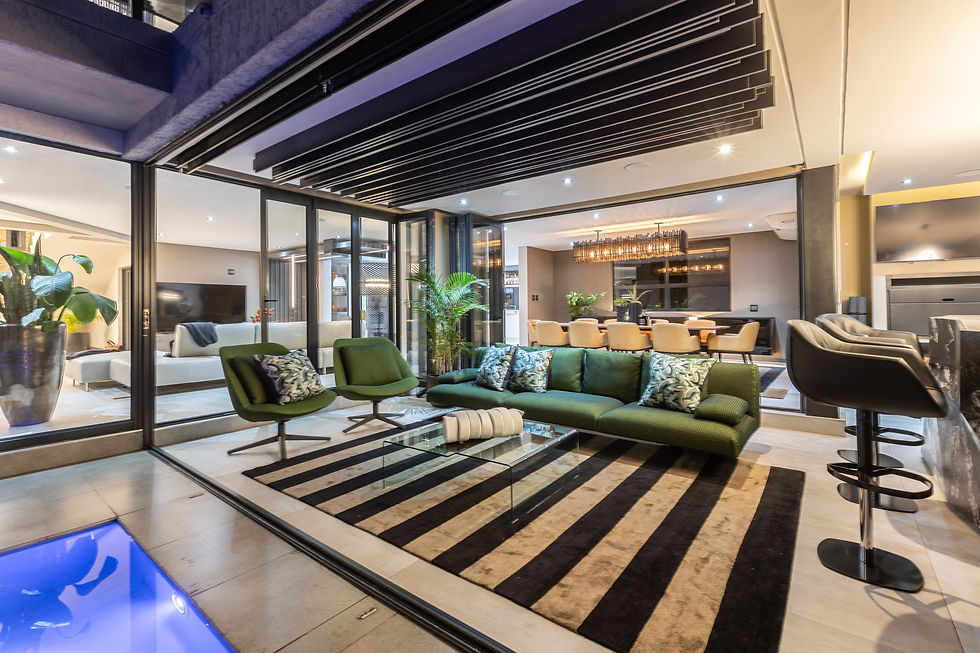
Green represents equilibrium. It’s the color of nature, yes, but also of balance, sitting directly between warm and cool on the spectrum. A soft sage in a wellness room or a rich forest tone in a music salon can link the indoors with the organic world outside, especially when paired with natural light and living plants.
Violet or muted purples bring an air of introspection. They’re cerebral and slightly mysterious; suitable for art galleries, personal sanctuaries, or meditation spaces. When used with restraint, these shades create environments that encourage reflection and creativity.
One of our clients, a hedge fund principal based in Zurich, came to us with a singular request: “I want a space where I don’t have to think.” We interpreted this as a call for serenity. We designed his penthouse master suite in layered grays with undertones of blue. Linen drapes in soft periwinkle moved gently in the alpine breeze, and the walls were treated with a matte mineral paint that shifted tone throughout the day. The space didn’t just look peaceful; it felt like an exhale. “I never thought color could silence a room,” he told us, “but here, it does.”


Neutrals & Earth Tones – Timeless Sophistication
If color is emotion, then neutrals are its quiet intelligence. They do not demand attention; they earn it; with subtlety, nuance, and longevity. In luxury interiors, neutral palettes are often misunderstood as "safe." But in truth, they are the most confident of all. A perfectly balanced neutral scheme is like a tailored Savile Row suit; understated, but unmistakably intentional.
At 8687 Studios, we treat neutral and earth tones as the architectural bones of a space. They create calm without being cold, elegance without being extravagant. More importantly, they provide a timeless canvas for layering; inviting natural textures, tactile finishes, and statement pieces to shine.
Beige, Taupe & Stone: These tones evoke grounded luxury. They work exceptionally well with organic materials; linen, travertine, raw wood, and adapt seamlessly to both contemporary and classic settings. Used right, they feel like silence in visual form.
Grays: A foundational tone in many of our projects, gray offers extraordinary versatility. From soft dove to charcoal, it can lean warm or cool depending on light and pairing. It’s ideal for transitional areas like entrance halls or corridors where mood shifts are subtle but crucial.
Earth Tones: Think terracotta, sand, ochre, clay. These colors root a space in nature. They reference earth and heritage; rich soils, artisan pottery, and sun-baked architecture. Earth tones are especially impactful in holiday homes or spaces designed for reconnection.
We designed a private game lodge in the Limpopo Valley for a couple whose primary residence was in Amsterdam. The brief was: “a space that feels eternal.” We avoided trends entirely and built a palette from the land; olive-toned stone, sand-colored lime plaster, darkened wood, and iron-rich clay hues. No room shouted for attention, yet every corner whispered refinement. The result was a tactile, grounded luxury that felt untouched by time.
Bold vs. Muted – Making the Statement
In design, much like in life, every choice is a declaration. Bold colors are not inherently better than muted ones, nor are they louder. The true difference lies in what they say. A bold hue shouts with certainty. A muted tone, when chosen with care, speaks in a near-whisper, but with equal conviction.
Our role at 8687 Studios is not to prescribe, but to translate. We ask: What do you want your home to say when no one is speaking? A bold, lacquered emerald wall in a private gallery might communicate daring and sophistication. A room in layered grays and clay might suggest discretion, depth, and timeless taste.
Bold doesn’t always mean bright. It means deliberate. Consider:
Accent Walls or Ceilings: A deep teal ceiling in a cigar lounge creates intimacy and drama, drawing the eye upward and enveloping the room in color.
Art & Collectibles: Bold colors often serve as the perfect canvas, or counterpoint, for high-value artwork or sculptural pieces. A matte black wall, for instance, can elevate a vivid Rothko or a hand-carved African mask.
Unexpected Areas: Powder rooms, walk-in wardrobes, wine cellars, and small spaces can carry boldness elegantly because their intensity doesn’t need to last long. These are the moments that surprise and delight.
Muted tones often carry more emotional complexity. They evolve throughout the day. A soft mushroom gray may feel warm by sunrise and cool at dusk. Muted palettes encourage introspection and layering; they are perfect for those who prefer depth over drama.
In a recent project for a Belgian collector, we created a palette inspired by patinated metals and overcast skies. Pewter, olive, and dusty lavender merged with brushed brass and natural stone. The space felt cinematic, not because of intensity but because of restraint.
Personalizing Your Palette – Lifestyle, Legacy & Luxury
True luxury is never generic. It’s deeply personal; quietly informed by your experiences, your rituals, and your sense of place. In the world of high-end interiors, color is not a trend to follow, but a language to master. It’s how we express identity without a single word. It’s how we immortalize memory, taste, and intention into the built environment.
At 8687 Studios, personalization is not an aesthetic choice; it is the foundation. The most meaningful palettes emerge not from Pinterest boards or paint charts but from life: the ochre dust of the Serengeti, the blue of a Greek summer sky, the tobacco leather of a well-worn heirloom chair. We don’t begin with “what’s in style.” We begin with what matters to you.
To personalize a palette effectively, we look beyond color preferences. We ask questions like:
Where do you feel most alive? Where do you feel most calm?
What pieces in your life; furniture, art, clothing, do you return to, time and again?
What values do you want your space to communicate: heritage, innovation, serenity, boldness?
These questions shape the palette like a sculptor shapes clay.
One client, a South African-born entrepreneur living between Paris and Cape Town, wanted his Johannesburg residence to reflect his global lifestyle while grounding him in African soil. We created a palette from his own archive of photographs, sun-bleached reds, indigo-dyed cloth, and the burnished gold of his grandmother’s jewelry. Every room told a chapter of his story.
Color personalization is emotional curation. It’s less about decorating, and more about distilling. Like a perfumer blending base, heart, and top notes, we layer foundational hues, accents, and finishes that reflect both the client's present and their aspirations.

Color is never just color. In the realm of refined interiors, it is memory. It is energy. It is intention, mood, and meaning distilled into form. The hues we choose to surround ourselves with; whether bold or muted, warm or cool, are, in many ways, self-portraits. They reflect our rhythms, our rituals, our pasts, and the legacies we wish to build.
At 8687 Studios, we don’t simply design rooms. We design experiences, color-driven atmospheres that support how our clients live, feel, and move through the world. Whether you are drawn to the tranquility of slate gray, the sensual warmth of ochre, or the quiet opulence of bone white, your palette is an extension of your identity.
And identity, after all, is the ultimate luxury.


Comments