
Colour Temperature and Spatial Perception: Light Isn’t Neutral
- Theo Arewa-Bothma

- Jun 16, 2025
- 7 min read
How Warm, Cool, and Neutral Lighting Transforms Space, Mood, and Luxury Interior Design
Step into a perfectly composed living room at dusk. Light spills softly across a travertine floor, casting golden reflections on brushed bronze fixtures. The moment feels curated, like a scene from a film that never ends. But this isn’t just design. It’s not just architecture. It’s the orchestration of light, the warmth of its tone, the angle of its cast, the precision of its purpose.
In the world of high-end interiors, light is never an afterthought. It is as much a material as stone, as decisive as form. And yet, one of its most powerful qualities, the colour temperature, often goes unnoticed. Subtle but transformative, it shapes the way we perceive space, mood, and movement. It’s the reason a room can feel expansive and crystalline in one moment and cocooned in intimacy the next.
At Studio 8687, we believe lighting design is more than function; it is narrative. It’s how a home tells its story at different times of day, in different states of mind. In this article, we’ll explore how colour temperature; whether warm, cool, or neutral, has the power to completely redefine your living experience. We’ll delve into the psychology of light, the science behind its temperature, and how thoughtful application can elevate your space from simply beautiful to deeply alive.

Defining Colour Temperature
Imagine walking from a candlelit wine cellar into a sleek, marble-clad art gallery. The feeling changes instantly, not because the materials are different, but because the light shifts. One embraces you in amber warmth, the other opens up in brilliant clarity. This is colour temperature in action.
At its most fundamental level, colour temperature refers to the hue of white light, measured in Kelvins (K). Lower temperatures, typically around 2 700K to 3 000K, emit warm, golden tones similar to firelight. As you move higher on the scale, toward 5 000K and beyond, the light becomes cooler, clearer, and more like daylight on a crisp winter morning. In between, at around 4 000K, lies the neutral zone: balanced, unobtrusive, and flexible.
But this isn’t just technical data; it’s the emotional register of a room. A soft 2 700K glow evokes heritage, comfort, and conversation. A 5 500K wash, on the other hand, speaks of precision, order, and expansiveness. Like the notes of a fragrance, the temperature of light sets an emotional tone long before one notices texture or colour.
In our projects at Studio 8687, we often begin by asking a simple but revealing question: “How do you want to feel in this space?” Clients who envision warm, layered evenings of wine and jazz are drawn to lower temperatures, whereas those who prefer clean lines and gallery-style clarity lean toward cooler spectrums. It's less about right or wrong and more about alignment, between intention and sensation.
Consider the penthouse suite we designed on the Atlantic Seaboard: during the day, motorized blinds welcome natural daylight into the space, complemented by cool, high-CRI LEDs that highlight architectural geometry and art installations. But as evening falls, the lighting system warms automatically, softening edges and inviting reflection. The light shifts with you, supporting not just how the room looks, but how it lives.
In essence, light isn’t neutral. It's expressive, responsive, and deeply human. By understanding its temperature, we begin to harness it, not just to see, but to feel.
Spatial Perception & Psychological Impact
There’s a quiet kind of magic that happens when light reshapes space, when a narrow hallway suddenly feels broader, or a cavernous room wraps you in warmth without a single wall being moved. This is where the psychological power of colour temperature reveals itself, not just as illumination, but as illusion.
Cooler light, typically above 4 500K, tends to create a sense of openness and distance. It sharpens edges, clarifies surfaces, and visually expands a room. In contemporary interiors where minimalism meets high-functioning elegance, cooler tones bring a sense of control and spaciousness. It’s the reason clinical spaces feel vast and why a museum’s skylit gallery can make a modest painting feel monumental.
But light isn’t just spatial; it’s emotional.
Warm light, hovering between 2 700K and 3 000K, draws surfaces closer to the eye. It softens shadows, flattens contrast, and blurs hard lines. The result? A space that feels embracing, grounded, and human. Think of a reading nook at golden hour or a supper club’s low-glow intimacy. The warmth doesn’t just change what you see, it changes how you feel in it.
This is where the artistry of lighting design comes alive: in layering spatial perception with emotional resonance. High-net-worth individuals aren’t simply seeking square metres; they’re seeking meaning, atmosphere, and identity in their spaces. Colour temperature is an invisible architect, defining boundaries without building walls.
At Studio 8687, we treat light as both instrument and invitation, an element that moves with your rhythms and reflects your lifestyle. Whether it’s a minimalist glass pavilion or a layered, heritage-infused estate, we design with the knowledge that perception is not just about what we see, it’s about what we sense.


Function-Driven Temperature Selection
Luxury is never one-dimensional. A single space must often support multiple ways of living; hosting guests, unwinding in solitude, catching up on work, or simply pausing for beauty. In these moments, lighting does more than illuminate; it defines purpose. And choosing the right colour temperature becomes a quiet act of precision, where function meets feeling.
At Studio 8687, we approach lighting as we would any bespoke design element: contextually, with nuance. No two rooms serve the same emotional role, and neither should their lighting. Temperature selection must match intention; otherwise, the design, no matter how visually striking, can feel disjointed or out of sync with its user.
Take, for instance, the living room, often the emotional nucleus of a home. For spaces centred on gathering, comfort, and conversation, we favour warm colour temperatures between 2 700K and 3 000K. These tones soften materials like timber, stone, and linen, enhancing their tactile appeal. In a lakeside villa we recently completed in the Italian countryside, we used low, warm up-lighting along a fluted travertine wall to mimic the ember-glow of a fading fire. The result? A space that whispers instead of shouts is ideal for wine, music, and storytelling.
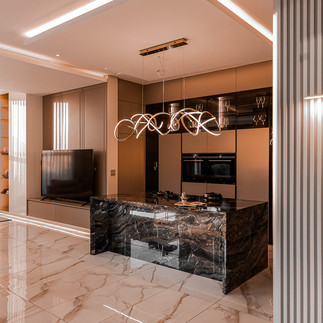
By contrast, home offices, kitchens, or dressing areas require clarity and alertness. These are places where detail matters. Here, neutral to cool light in the 4 000K–5 000K range sharpens perception and keeps colour rendering true.
And then there are the ritual spaces; wine cellars, walk-in wardrobes, private spas, where lighting should lean into mood. Think dimmable 2 400K luminaries nestled in alcoves, or hidden LED strips that graze surfaces in liquid amber. In a Moroccan-inspired wellness suite we designed, layers of warm light shimmered across tadelakt plaster, turning every soak into ceremony.
The most forward-thinking homes use tunable lighting systems, allowing each room, or even each moment within a room, to shift temperature based on activity, time of day, or even season. This is not about novelty, but about tailoring space to life’s natural rhythms.
Function-led temperature planning is not about compromise. It’s about achieving resonance between how a space is used and how it feels to inhabit. With the right lighting palette, a home becomes adaptable, expressive, and deeply attuned to its owner's lifestyle.
Luxury Meets Sustainability: The New Frontier
For today’s most forward-thinking home-owners, luxury is no longer defined by excess, it’s defined by intelligence, by intention, by longevity. In this evolving paradigm, lighting doesn’t just elevate a home’s aesthetic; it affirms its values. And when colour temperature meets sustainability, the result is a seamless fusion of beauty, performance, and environmental responsibility.
At Studio 8687, we often speak of “silent technologies”, systems that work invisibly but profoundly behind the scenes. High-efficiency LED lighting, smart dimming protocols, circadian-friendly schedules, these are not mere upgrades. They are signatures of a sophisticated, future-oriented home.
Modern lighting systems now offer precise control over colour temperature and energy consumption. LEDs, once harsh and impersonal, have evolved into tunable, dimmable, and incredibly nuanced tools. They can shift from a crisp 5 000K at midday to a gentle 2 700K after sunset, mirroring natural light cycles and reducing visual fatigue. The result isn’t just a beautiful interior, but a biologically supportive environment that honours how we’re meant to live.
True luxury lies in designing spaces that are not only elegant, but enduring, designed to enrich lives now and into the future. By merging colour temperature control with sustainable lighting technologies, we don’t just shape beautiful rooms. We shape meaningful legacies.

In the symphony of spatial design, light is the final, most emotional note. It holds the power to expand or contain, to energise or soothe, to sharpen or soften, all without lifting a single wall or changing a single object. And at the heart of this dynamic force lies colour temperature: an element as invisible as it is indispensable.
When thoughtfully considered, colour temperature becomes more than a technical specification; it becomes a language. It speaks in feeling, in function, and in nuance. It defines how your home wakes with you in the morning, supports your clarity during the day, and wraps you in comfort as evening falls. It shapes the narrative of your lifestyle quietly, elegantly, profoundly.
At Studio 8687, we see lighting as a craft, not a commodity. We work not just with luminaires, but with atmospheres. Not just to illuminate, but to elevate. Our work is about designing spaces that don’t simply look beautiful, but live beautifully.
In a world where homes are becoming sanctuaries, showpieces, and strategic investments all at once, there is no longer room for generic solutions. The future of design lies in personalization, in performance, and in emotional resonance. Light, when designed with care and clarity, brings all three into perfect alignment.
So, as you walk through your space this evening and the lights begin to change, ask yourself: Is the light supporting how I want to feel? And if not, imagine what it could be; with intention, with artistry, and with us.


Comments