
Colour Blocking in Interiors
- Theo Arewa-Bothma

- Jul 8, 2025
- 9 min read
How Bold Colour Blocking Transforms Luxury Interiors into Bespoke Statements of Style and Personality
Imagine stepping into a grand living room where vast planes of colour greet you like a bold modern painting come to life, a striking teal wall framed by a deep saffron sofa, while a creamy white ceiling seems to float above like a calm sky. The space pulses with energy and personality, yet every element feels perfectly balanced, deliberate, and undeniably luxurious. This is the art of colour blocking, a design language that speaks boldly without shouting, transforming interiors into statements as unique as the individuals who inhabit them.
For those who seek more than mere decoration, colour blocking offers a sophisticated way to infuse a home with both vibrancy and harmony. It’s a daring yet thoughtful technique that layers large blocks of contrasting or complementary colours, crafting a visual rhythm that energizes and enlivens without overwhelming. Much like a symphony where each instrument plays its part to create an unforgettable melody, each colour block in your interior plays a vital role in shaping mood, guiding movement, and reflecting personal style.
At Studio 8687, we understand that your home is your ultimate canvas, a place where contemporary elegance meets enduring comfort, where every design choice is a reflection of your story. This exploration into colour blocking invites you to reconsider how colour can do more than simply fill a space; it can define it, uplift it, and make it unmistakably yours.

Foundations of Colour Blocking
To appreciate the transformative power of colour blocking, it’s essential to start with its roots, a design philosophy born from the marriage of art and modern living.
Picture the work of Piet Mondrian: a grid of thick black lines framing radiant blocks of red, blue, and yellow, balanced with pristine white spaces. Or the sweeping, emotive fields of colour in Mark Rothko’s paintings, where large, layered rectangles invite you into contemplation. These iconic artists distilled colour to its purest essence, using bold shapes and contrasts to evoke emotion and provoke thought. Colour blocking in interiors carries this spirit into the tangible world, turning walls, furniture, and décor into architectural brush strokes.
But colour blocking is more than an echo of art history; it is a tool that harnesses color’s innate power to create structure and movement within a space. It demands an understanding of contrast and complementarity, where the interplay between colours can either spark dynamic tension or serene harmony. For instance, pairing a midnight navy wall with a burnt orange armchair can awaken a room with energy and warmth, while soft blush and sage blocks can soothe and invite quiet reflection.
The essence lies not only in which colours you choose but how you balance their scale and placement. Large expanses of bold colour must be carefully weighed against neutral zones or smaller accents to maintain a sense of flow and elegance, much like a well-composed piece of music where pauses and crescendos coexist.
When guiding clients through this process, I often ask: “How do you want your home to feel the moment you walk in? Energized like a bustling cityscape at dusk, or calm like a secluded garden at dawn?” Their answers help us curate palettes that become emotional landscapes, spaces that tell stories without uttering a word.
Take Kelly Wearstler’s Viceroy Hotel suite, for example, where magenta and obsidian walls create a dramatic yet inviting backdrop for sleek metallic accents and plush textures. This interplay exemplifies how colour blocking can elevate a room from mere function to immersive experience, a principle Studio 8687 applies to every bespoke project.
Colour Theory Mastery for the Luxury Home
Colour is far more than a decorative choice; it’s a language that speaks directly to our emotions, shapes our perception of space, and orchestrates the rhythm of daily life within a home. In luxury interiors, mastering colour theory elevates colour blocking from a mere trend into a sophisticated design strategy that resonates deeply with the homeowner’s lifestyle and aspirations.
Think of colour as the invisible architecture of mood. Warm hues like amber and terracotta wrap a room in an embrace reminiscent of a sunset’s glow, evoking feelings of comfort, intimacy, and groundedness. Cool tones; soft blues, deep teals, offer respite, like the calm depths of a still lake, inviting tranquillity and reflection. In a high-end residence, this emotional resonance is paramount; the colours must not only please the eye but nurture the soul.
However, in the realm of colour blocking, scale and intensity become vital. A large block of a highly saturated colour can feel like a vibrant exclamation point in the space, commanding attention and energizing the senses. Conversely, the same hue muted or paired with lighter tones can act like a gentle whisper, subtly shaping ambiance without overpowering it.
Texture and materiality are the unsung heroes that enhance this dynamic. Imagine a grand wall painted in a matte, mineral-based pigment absorbing light softly versus one finished in a glossy lacquer that reflects and multiplies it. Each choice shifts how the colour reads and interacts with its surroundings, creating layers of visual interest and tactile engagement. Luxury is found not just in colour itself, but in this nuanced interplay of surface and shade.
When I consult with discerning clients, the conversation often revolves around questions like: “What energy do you want your reception area to radiate? Should it inspire awe and vitality, or calm sophistication?” These emotional goals guide the selection and pairing of colours, ensuring the home becomes a personalized sanctuary rather than a generic showroom.
A prime example is Peter Marino’s Chanel flagship boutiques, where monochrome blocks of black and white interplay with luxurious materials, soft leathers, polished metals, creating spaces that feel at once minimalist and richly textured. The strategic use of colour blocking here is not loud; it’s purposeful, elevating the experience of luxury retail into something deeply memorable.
In your home, this mastery over colour can transform a simple corridor into a dramatic passage of shifting moods, or a living room into a gallery of emotional expression, inviting guests and residents alike into a dialogue of colour, light, and texture.


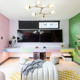
Strategic Placement & Scale
In the art of colour blocking, knowing where and how to apply those sweeping blocks of colour is as crucial as the colours themselves. Think of your interior as a grand stage, and each colour block as a carefully positioned spotlight; it must highlight, not blind; invite, not overwhelm.
The first decision is often whether to designate a feature wall or to explore more unexpected canvases like the ceiling. A vibrant, color-blocked wall can instantly become the heart of a room, drawing the eye and defining the space’s energy. But when the ceiling wears a bold hue, it transforms from a mere architectural boundary into a soaring canvas that uplifts and expands the room’s presence. Imagine walking into a lounge where the ceiling is bathed in a luxurious ochre, wrapping you in warmth and making the room feel both intimate and expansive, a trick often mastered by visionary designers like Axel Vervoordt.
Beyond walls and ceilings, furniture and cabinetry can serve as dynamic colour blocks, turning functional pieces into sculptural statements. A deep emerald velvet sofa or a matte black lacquered cabinet doesn’t just furnish a space, it anchors it, creating pockets of rich colour that invite touch and admiration. Pair these with custom rugs that echo the palette to tie the room into a harmonious whole.
Scale is the silent conductor orchestrating these elements. Large blocks require breathing room, ample neutral space or softer hues, to maintain elegance and prevent sensory fatigue. Conversely, smaller bursts of colour placed thoughtfully can punctuate and enliven without competing. Like a masterful painting, the composition must balance boldness with restraint.
When advising clients, I often ask: “Would you prefer the drama of a single, commanding colour block that anchors your living room, or do you envision a dance of multiple colour fields weaving through your space?” Their lifestyle and taste determine whether the design sings with bold solos or harmonized ensembles.
Consider the Antwerp penthouse designed by Axel Vervoordt, where a vast ochre ceiling stretches overhead, framing a collection of art objects and bespoke furnishings below. The color’s scale transforms the entire room into a warm embrace, demonstrating how thoughtful placement can elevate colour blocking beyond mere decoration into an immersive experience.
At Studio 8687, we embrace this philosophy, curating not just colours, but experiences, ensuring every colour block serves a purpose: to enhance, to define, and ultimately, to tell your unique story.
Harmonizing with Materials & Textures
Colour blocking is not simply about painting walls or selecting bold hues, it’s about weaving colour into a rich tapestry of textures and materials that breathe life and depth into every surface. Think of a colour block as a chord in a symphony; it gains resonance when paired with the right instruments, in this case, textures that add tactile and visual harmony.
Imagine a striking fuchsia wall finished in Venetian plaster, its surface catching light like a softly rippling silk scarf. Or a deep teal cabinet upholstered with bouclé fabric, its nubby texture inviting touch and softening the intensity of the colour. These textural juxtapositions elevate the colour from flat pigment to an experience that delights multiple senses, making a room feel curated and profoundly luxurious.
Natural materials offer a particularly compelling counterpoint to bold colour blocks. A handwoven sisal rug underfoot or exposed wood beams overhead ground vibrant hues in nature’s subtle palette, creating balance and warmth. At Studio 8687, we champion the use of sustainable finishes, from mineral-based paints with low VOCs to artisan-crafted wallpapers embedded with glass beads, that not only enrich texture but also align with a conscious, responsible approach to luxury.
The choice of finish can dramatically alter the perception of colour. Matte and plastered surfaces absorb light, lending depth and mystery, while glossy lacquers reflect and amplify, adding a sense of movement and modernity. When layered thoughtfully, these effects play off one another like a duet, enhancing the spatial narrative.
When collaborating with clients, I often pose a sensory challenge: “Close your eyes, can you feel how the wall’s surface interacts with your mood? Does it soothe or invigorate?” This immersive approach ensures colour blocking transcends aesthetics and becomes an intimate, lived experience.
A stunning example is François Champsaur’s Marrakech villa, where fuchsia tadelakt walls blend seamlessly with natural sisal flooring and handcrafted textiles. The result is a space that feels both vibrant and grounded, worldly yet deeply personal, a master-class in texture and colour synergy.
In your own interiors, embracing this marriage of colour and texture can transform flat expanses into canvases that invite touch, evoke emotion, and elevate the everyday into art.
Integrating Sustainability
In today’s luxury landscape, bold design choices and environmental responsibility are no longer mutually exclusive; they are the twin pillars of truly refined living. Integrating sustainability into colour blocking not only honours the planet but also enriches the narrative of your home, adding layers of meaning and timelessness to every vibrant surface.
Sustainable pigments have evolved remarkably. Mineral-based and plant-derived colours offer the same vivid intensity as synthetic counterparts but with a far gentler footprint. Imagine walls painted with earthy, non-toxic pigments that shimmer subtly in natural light, colours that connect your interiors to the very earth they spring from. These choices resonate deeply with clients who view their estates as legacies to nurture, not just assets to display.
The materials paired with colour blocks can also embody sustainability without compromising luxury. Reclaimed woods, artisan-crafted textiles, and recycled metals add story-rich textures that complement and enhance bold colours. At Studio 8687, we champion collaborations with local artisans who employ traditional methods and eco-conscious practices, ensuring each colour block carries a narrative beyond aesthetics.
Durability and timelessness are equally crucial. Choosing colours that transcend fleeting trends, paired with finishes designed to age gracefully, creates interiors that remain compelling year after year. This thoughtful longevity not only reduces waste but also respects the investment and vision of a discerning home-owner.
When discussing sustainability with clients, I often ask: “How does your home’s design reflect your values—both personal and environmental? Which materials and colours feel authentic to that vision?” This dialogue transforms design from a transaction into a legacy-building journey.
A compelling example is the Brentwood Hills residence by an alumnus of TBAD, where deep emerald clay plaster walls, crafted from locally sourced, natural materials, harmonize with FSC-certified panelling. The result is a bold yet deeply grounded home, proving that sustainability and statement-making design can coexist beautifully.
Incorporating eco-conscious materials and pigments into colour blocking elevates your home from a visual masterpiece to a meaningful, responsible sanctuary, one that respects both luxury and the world we share.

Colour blocking is far more than a design trend, it is a powerful language that transforms interiors into living expressions of personality, passion, and purpose. By embracing bold fields of contrasting or complementary colors, carefully balanced with texture, scale, and sustainability, your home becomes a dynamic canvas that both energizes and comforts.
At Studio 8687, we believe that every space should tell a story, yours. Through the artful application of colour blocking, we craft environments that are not just visually striking but deeply personal, inviting you to live boldly and beautifully within them.
As you envision your next chapter in luxury living, consider how the strategic use of colour can elevate your interiors from the ordinary to the extraordinary. Let your home be a signature statement, a sanctuary that inspires, delights, and endures.
We invite you to take the first step: engage with our design experts for a bespoke consultation. Together, we’ll explore how the timeless power of colour blocking can create a space that’s unmistakably and unapologetically yours.


Comments